4 Trendy Web Designs That You Can Implement
What are some trendy new web designs you can implement?
- Brutalism
- Digital Illustrations
- Video Headers
- Gradients And Duotones
In the world of web design, trends are almost always dictating the pace and development of a website’s overall identity. Whether it’s the aesthetic, interactivity, usability, or sound design, web designers are always pushing the boundaries of what is possible on the web. Aside from adding different tools like a WordPress survey plugin, or changing the typography of the website, there are many more ways to make your web design more trendy.
That being said, not all styles can be considered ‘in’ so it could potentially be hard for you to choose the right style for your website. To help you out, here are 5 trendy web designs that you can implement.
Brutalism
Those who are not too familiar with Brutalism as a style might be a bit unsettled by its name. To be sure, brutalism is not about physical harm or escalating violence. Rather, it is all about being ‘raw’. This ‘raw’ characteristic alludes to adhesion to the core concepts of being a website. To put it simply, it’s about sticking to the script, being honest, and flaunting the qualities that make a website, a website.
A website is not a magazine, despite magazine-like content. It is also not an application in spite of the many things you can do. A website is about giving visitors content to enjoy and ways to interact with you. Brutalism is simply about being ‘brutally’ honest, but what does this entail for your web design anyway?
Here are a general set of rules:
First, you need to have quality content that can be read or consumed in most (all if possible) screens and devices. Some screens can be huge (monitors and projectors), and some can be small (smartphones).
Make sure that only hyperlinks and buttons respond to clicks. Having other clickables that aren’t about navigating to another webpage or submitting information back to the server can confuse and misdirect your visitors. Visually, hyperlinks also need to look like hyperlinks and buttons like buttons, so always check the format.
Websites have to be scroll-friendly. This is especially important if the content cannot fit on one page, and it also enables viewers to keep browsing without having to reload the page or moving to a new one.
Lastly, decorations must be kept to a minimum and should only be incorporated as needed. This pertains to the website’s colors, graphics, pictures, sensationalist headlines, and other features that can potentially serve as distractions.
Implementing these rules and guidelines can improve your site and give it an interesting and direct feel.
Digital Illustrations
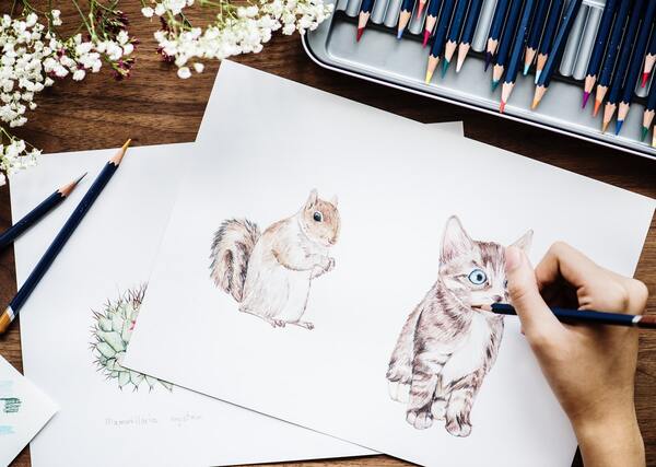
Digital illustrations are now one of the most important trends in web and visual design. Illustrations that are relevant to the content can make your website stand out from the rest, and can establish a connection between you and your visitors. Digital illustrations are versatile because they can be used for various purposes, and can be placed in different sections of a website.
Different types of digital illustrations can be used namely, hand-drawn flat images or three-dimensional ones. Flat illustrations have been a staple in web design for a while and have always been used to express an illustrator’s creativity and identity. Meanwhile, three-dimensional illustrations are a more recent development. They make a drawing more realistic and can help your content be more relatable as well as interesting.
Video Headers
Imagery plays a key role in visual design because it helps deliver the main idea of your content quickly. That being said, video headers have become more popular as opposed to static imagery. The main reason for this is an increase in the global accessibility of high-speed internet, giving your web viewers more power and the ability to load videos quickly. People are aware of this and, as a result, are more inclined to watch videos on websites.
When implemented in your website header, your site itself becomes more immersive and captivating. Make sure you choose the right video accompanied by proper audio to add an even bigger edge to your website.
Gradients and Duotones
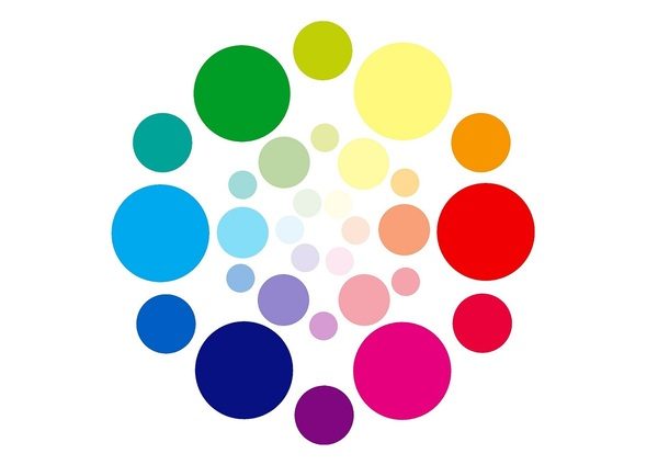
In terms of color schemes and visual aesthetics, gradients are a mainstay in a web designer’s toolbox. This is because it can work in almost any design and always adds a level of depth. The modern style of using gradients involves the use of bold and bright colors that allow the designer to make a statement. Just make sure to follow a certain color block or scheme to make it more pleasing to the eye.
In the same vein, using duotones for a site’s color scheme can be an interesting way to change up your website’s design. Duotone means using only two colors to create an identity. Take Facebook, for example. Their website and pages are always just blue and white throughout. This can be helpful in marketing as well as a user’s experience. Simply use your brand’s primary color as the duotone filter
Key Takeaway
Web design is an interesting skill and discipline that can have an almost unlimited amount of possibilities. An important aspect involved in this endeavor is looking at the trends and following what the people like. Beautiful and interesting web design, when used with different tools such as a WordPress survey plugin, can help give your users and viewers an exquisite experience that can lead to better conversions and results.


