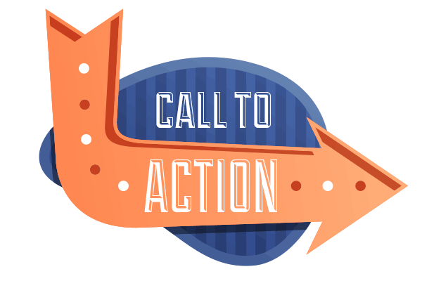
CRO 101: Call to Action
The internet is vast, heavily populated, and if play your cards right, extremely prolific. But getting your website to get to that stage of copiousness takes a lot of work. One of the main things to consider when building up your website is CRO (Conversion Rate Optimization) – it’s the use of analytics and user responses in order to improve your website’s performance and customer draw.
An essential aspect of CRO is the Call to Action – that’s the interface element (such as a button on your webpage) that encourages a user to commit an action you would want them to. However, just placing any button won’t do. There are certain guidelines to follow should you want an actively effective call to action prompt and here are some to help you on your way:
Button Design
The look of your call to action button must be attention grabbing enough in that people will know where it is and what it’s for, yet also subtle enough that it doesn’t overpower all the other elements of the given page. In addition, its design must match the overall aesthetic of the page – take care to observe design rules such as color harmony, geometry, or typography where applicable and to never overkill in terms of the design. Buttons can come in all shapes and sizes and there is no “one true button” to rule them all. Rather, the button’s effectiveness wholly relies on its synergy with its surroundings. A common mistake most people commit is creating call to action prompts that are much too big; sure it gets the attention of your visitors but instead of attracting them it may end up somewhat overpowering them. Bigger isn’t always better! Basically, if your button is well-balanced, well-presented, and well-designed, then it should goad more people into clicking it and thus funnel them into the next area of your website.
Button Copy
Having good copy is just as important, if not more, than the design. After all, no one would click on a button that says “click me to get a virus” no matter how well done the button style is. Make sure that your button label is able to convey your ideas or message in a clear and concise manner. Phrase it in such a way that it ends up being enticing too. “I want my free eBook” or “Start my free trial now” are good examples. Mind that “my” was used instead of “your” – this personalizes the button and is effective in drawing in more people to click. It’s small details like these that you need to watch out for. In short, make your text inviting, informative, and quick.
The Page
When optimizing your page for CRO, don’t think too much of the technicalities. Instead, focus your efforts on executing your plans to achieve the primary goals of your business and hastening your visitors’ decision-making process. ensure that your point gets across and sell what you need to sell. Make the quality of your content your top priority and grab your potential customers’ interest before anything else – otherwise, they may simply bounce. Remember that no matter how good your call to action prompt is, your visitors won’t click on it unless they’re interested in whatever it’s offering.
So, should you ever find yourself creating a webpage with a call to action prompt on it, remember these steps and you’ll be well on your way to better conversion rate optimization.